
Form components explained
Every field type you can drop onto a Knowella form — and when to use each one.
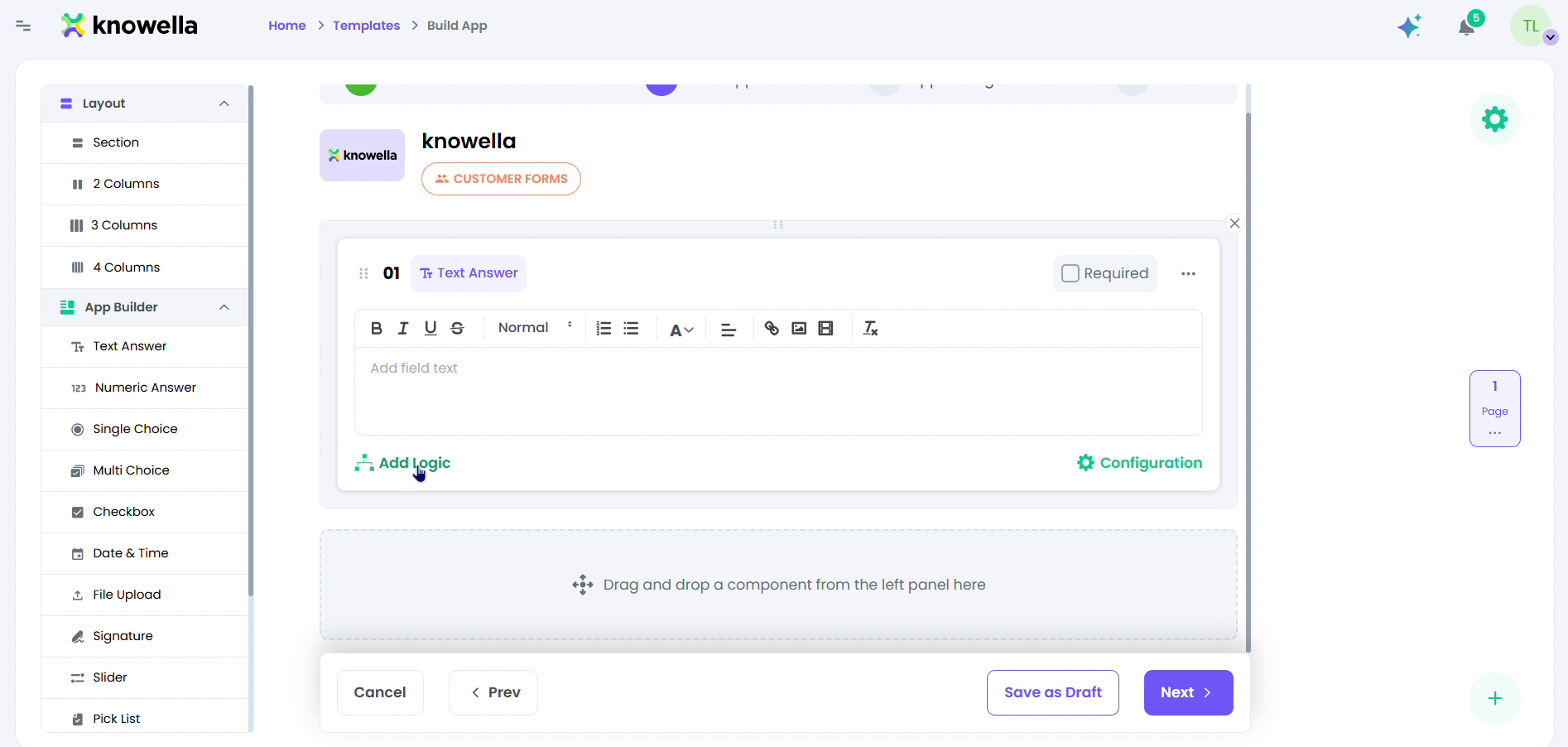
The component panel
This is the Build App canvas, where a form is assembled. The rail on the left is the component palette: Layout blocks at the top (Section, plus 2-, 3-, and 4-column rows) and below them the field types — Text Answer, Numeric Answer, Single Choice, Multi Choice, Checkbox, Date & Time, Signature, and Pick List. The center is the live form; you drag a component from the rail onto it and it appears ready to configure. The selected component here is a Text Answer, showing its rich-text prompt, a Required toggle, an Add Logic link, and a Configuration option — the same controls every component offers.
- Layout — Section headers and 2-, 3-, or 4-column rows to organize the form.
- Inputs — Text Answer and Numeric Answer for free-form and number entry.
- Choices — Single Choice, Multi Choice, Checkbox, and Pick List for structured answers.
- Field types — Date & Time, Signature, and Action components for real-world capture.
Match the component to the answer
Use Text and Numeric for open entry, Single/Multi Choice and Checkbox for structured options, Pick List for long option sets, and Date & Time or Signature to capture real-world facts. Structured components keep data clean and reportable — free text cannot be charted.
Layout is part of the design
Sections and multi-column rows group related fields so a long form reads as a few clear steps instead of an endless scroll — which is what gets it completed properly out in the field.
Ready to build your own?
Start free and ship your first app in minutes — or have us set it up with you.
More guides in Workflows & Forms
More resources